
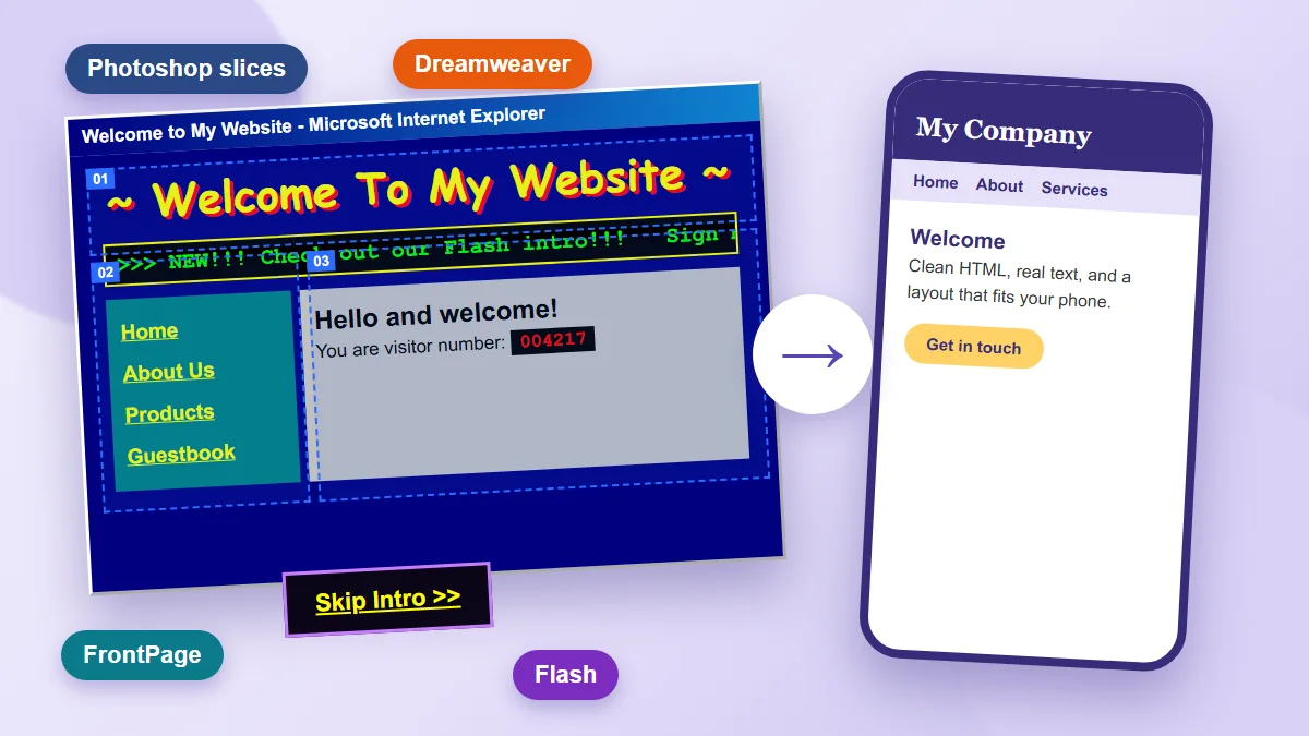
A conversation on LinkedIn this week started with a single question: does anyone remember slicing websites in Photoshop?
Within hours the replies had turned into a roll call. Layouts cut into pieces and exported as a pile of images. Rollover buttons made in ImageReady. The whole thing put together in Microsoft FrontPage, finished with a scrolling marquee of text that felt, at the time, like the future. Then came the quieter confession that follows in every one of these threads: I built entire websites in Flash. I even made small games. Someone else remembered moving from FrontPage to Dreamweaver and feeling like a real developer for the first time.
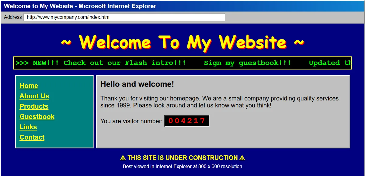
Those were fun days. Waiting for a rollover image to load over a dial-up connection, refreshing the page to watch the visitor counter tick up, and squinting at a site that was "best viewed at 800 x 600".
It is a fun trip back, and a more useful one than it looks. Every one of those techniques was, in its day, simply how you built a website, and almost none of them is how websites are built now. Photoshop and Dreamweaver are still around; what disappeared were the methods and the plug-ins. If you run a business, some version of that story may still be sitting on your own server.

The sliced layout
Slicing was an elegant answer to a real limit. Browsers in the late 1990s could not do rounded corners, gradients, drop shadows or custom type reliably, so designers drew the page in Photoshop, cut it into rectangles, and exported each rectangle as an image. An HTML table held the pieces together, often with transparent one-pixel spacer images to push things into place.
It looked exactly like the design, and it was built entirely from the wrong material:
- The text was a picture. Search engines could not read it, screen readers could not announce it, and changing a phone number meant reopening Photoshop.
- The layout was fixed. Slices assume one screen width. Nobody had a phone that browsed the web.
- Every change was a production job, not an edit.
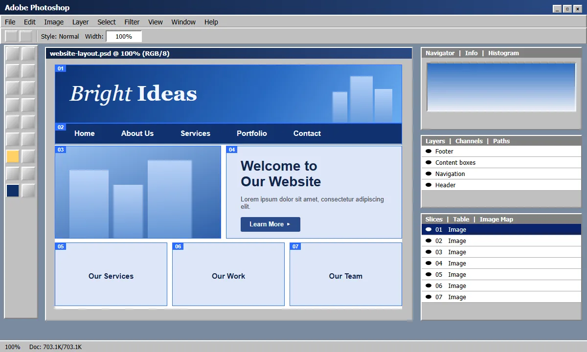
Each of those slices then had to be exported with its own compression settings, and the exported pieces looked like this on disk:
Rollovers, and the magic of the hover
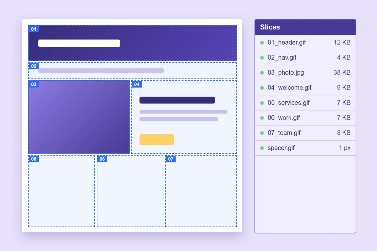
Slicing had a party trick. Cut a button out as its own slice, make a second picture of it glowing, a third of it pressed, and ImageReady would write the JavaScript that swapped one for the other as the mouse moved. It felt like programming without programming. It was also three images per button, a preloader to hope they had arrived, and a page that stopped working properly if any of it failed.
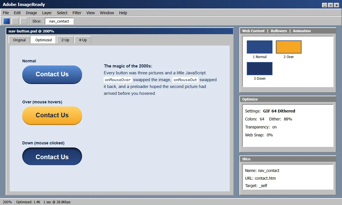
Today a single line of CSS, :hover, does the same job with no extra images and
no script at all.
Today the browser draws all of that natively, and the layout adapts to the screen. The design survived. The method did not.
From FrontPage to Dreamweaver
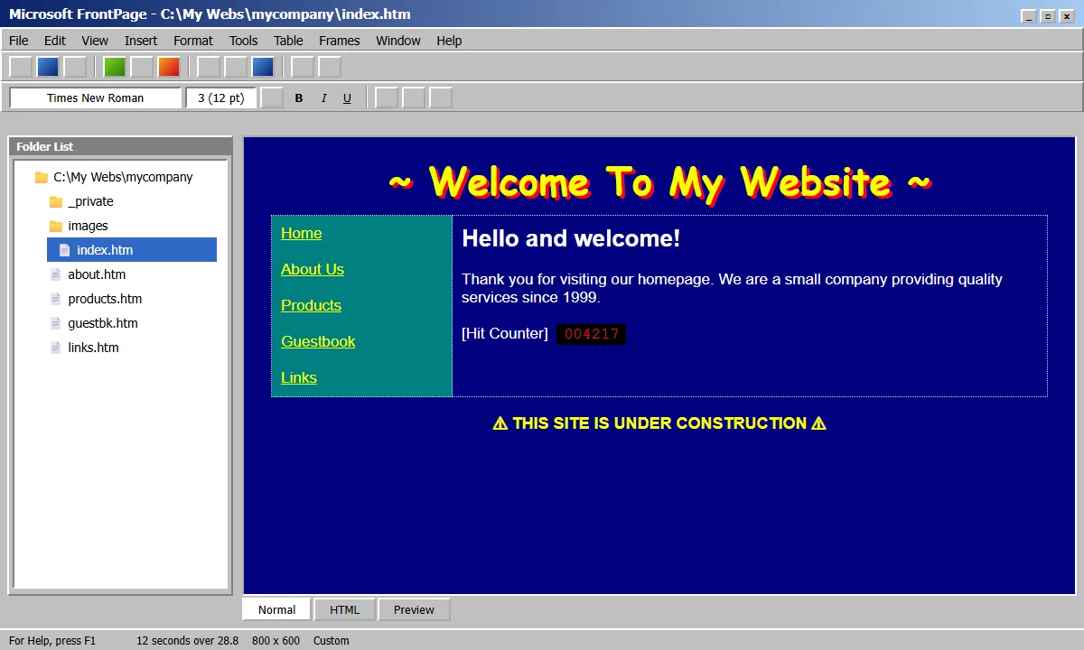
For a lot of us the first real editor was Microsoft FrontPage. It was genuinely democratising: someone with no coding background could drag things around, hit publish and have a website. The cost was in what it produced. Pages came wrapped in proprietary markup and generated files, and some features only worked on servers that had Microsoft's extensions installed.
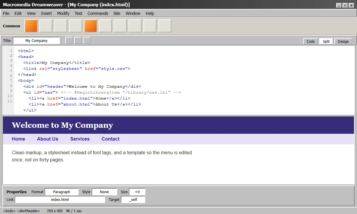
Then came the upgrade that felt like growing up: Macromedia Dreamweaver. It gave you a design view and a code view side by side, and it was the first tool that made many of us look at the HTML we were generating. It produced much cleaner markup, and it let you hand-edit it without the editor fighting back. Slicing and rollovers turned into templates and library items, and the whole workflow felt professional.
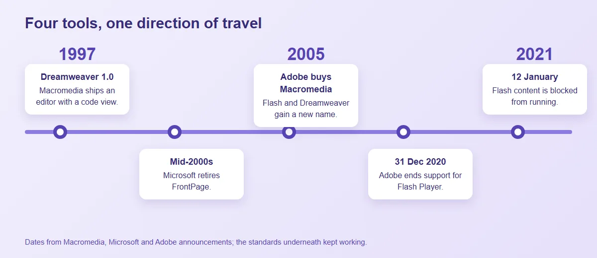
In 2005 Adobe acquired Macromedia, and the same tool became Adobe Dreamweaver. Microsoft, meanwhile, retired FrontPage in the mid-2000s. The sites built with it did not vanish, because plain HTML keeps working, but the editor that understood their quirks did. Anyone maintaining one afterwards was left editing code that had been written for a tool, not for a person.
The progression is worth noticing: each step moved towards cleaner, more standard output and more control for the person building. That is the direction the web kept travelling in.
The marquee
The scrolling text deserves its footnote, because it makes the point in one
line. The <marquee> element was never part of any standard, and
MDN lists it as obsolete
and says not to use it. Browsers still render it today, out of backwards
compatibility. A feature that was never standardised survived on goodwill;
Flash, which was far more popular, had no such luck.
Macromedia Flash, then Adobe Flash
Flash was the most ambitious of them. It started life as Macromedia Flash: animation, video, games and entire sites in a single plug-in, with a real programming language in ActionScript. The first time you made a button that glowed when the mouse went over it, or a preloader with a little bar that filled as the movie loaded, it felt like magic. Plenty of us built whole sites that way, and little games for the fun of it. It was a joy to build in, and the people who remember it most fondly are the ones who got good at it.
When Adobe bought Macromedia in 2005 it became Adobe Flash, and for a while it was everywhere: intros, banner ads, video players, the games everyone passed around at school and the office. "Skip intro" became a running joke, because so many sites made you sit through a loading bar before you could read a word.
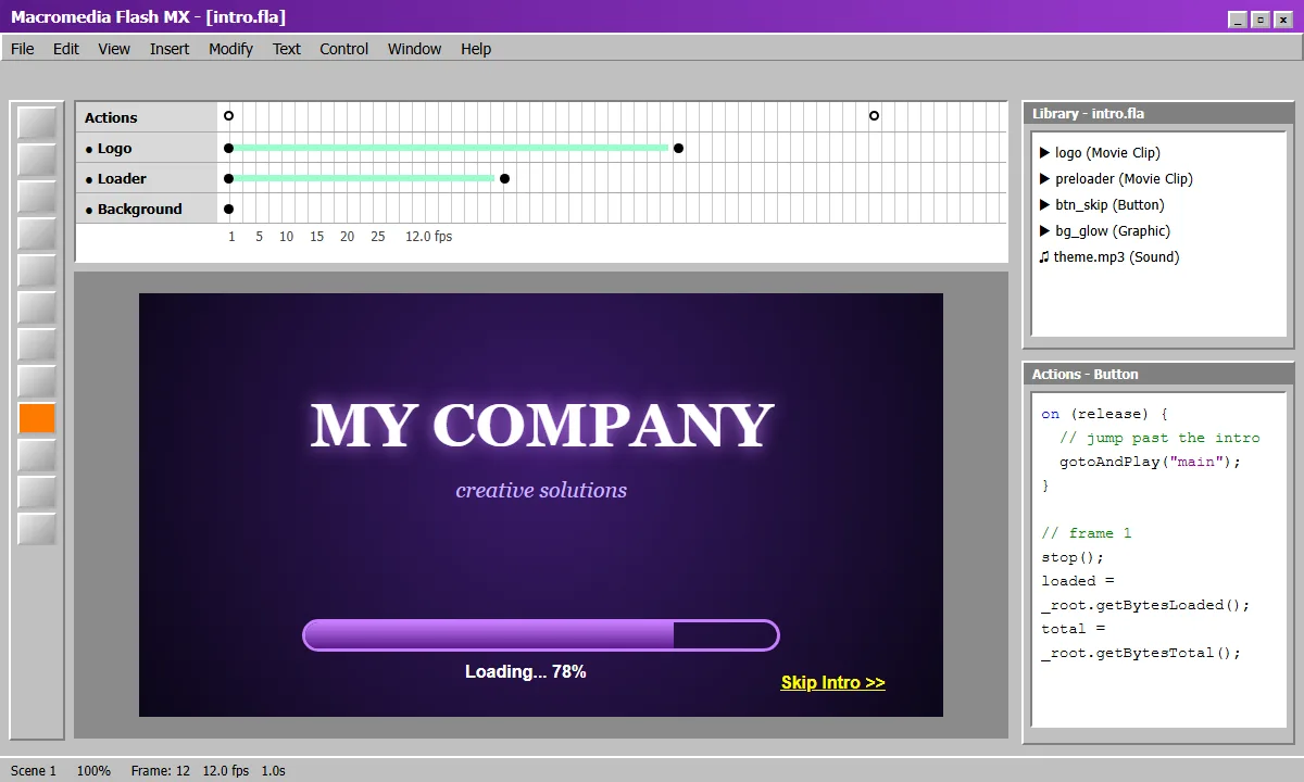
It was also a plug-in owned by one company. Apple never supported it on the iPhone, and as phones became how most people browse, Flash sites became sites that did not open for a large share of visitors. Content inside a Flash movie was hard for search engines to index and hard for assistive technology to read. Adobe ended support for Flash Player on 31 December 2020 and, from 12 January 2021, blocked Flash content from running at all, as its end-of-life notice records.
Whatever was inside those files went with it. Efforts such as Ruffle exist specifically to rescue old Flash content with an emulator, which is admirable, and also tells you how little there is to fall back on when the original format is gone.
What actually decides whether a site lasts
None of these sites broke because they were badly made. They broke because they depended on something the owner did not control. Three things made the difference.
Open standards outlast products. HTML, CSS and HTTP still work for pages written decades ago. Plug-ins and proprietary editors do not.
Content is separate from presentation. In a sliced layout the words were pixels. When text is text and the design is a stylesheet, you can redesign without rewriting.
You can walk away from your tools. If only the original editor can open your site, it has a countdown on it.
Is today's stack any different?
Fairly. It would be dishonest to pretend otherwise: front-end frameworks come and go, and a site that leans heavily on this year's fashionable library will face its own version of this problem. The honest answer is "better, not immune".
What has changed is that the standards underneath are now strong enough to do the job directly. Layout, responsive design, animation, forms and video are all built into the browser. That is why we lean towards server-rendered pages with a light layer of enhancement on top, an approach we describe in htmx and Alpine.js in production. If the library disappeared tomorrow, the pages would still be ordinary HTML.
It is the same reasoning behind the advice in when to modernise a PHP application: keep what works, replace the parts that depend on something that is going away, and do not rebuild for the sake of it. And whichever stack you pick, someone still has to patch and look after it, which is the subject of why ongoing website maintenance matters.
Does your own website still carry any of this?
Not many businesses are still running a Flash intro. But it is common to find a site that was built a long time ago for a tool, a browser or a screen size that no longer exists, and has simply been left alone since. Four quick checks will tell you whether yours is one of them:
- Open it on your phone. Does the page fit the screen, or do you have to pinch and scroll sideways to read it?
- Try to select the text. If the headings or the menu cannot be highlighted, they are probably images, and search engines see exactly what you see.
- Ask who can edit it. If the honest answer is "one person, on one old computer, using software that is no longer sold", that is the real risk.
- Check how fast it loads. Pages made of many small images, or built around heavy plug-in content, tend to be slow. We cover what that costs in why website speed matters for business growth.
If two or more of these sound familiar, you do not necessarily need to start again. The design, the wording and the page addresses people already know are worth keeping. What usually needs replacing is the way the site is built, so that it runs on standard technology you can maintain. That is the work we do in application modernisation.
Worth the nostalgia
None of this is an argument against the people who built that way. They made the best use of what the browser would do at the time, and many of the habits they learned, like caring about how a page looks and feels, carry straight into good work today.
But the lesson of the Photoshop slice, the FrontPage page and the Flash movie is the same. Build on what the web itself can do, keep your content in a form you can take with you, and plan for someone to maintain it. The tools of the next twenty years will look as quaint as the ones in that LinkedIn thread. The pages built on open standards will still be loading.